Introduction
Ever used an app that just felt right—without being able to explain why?
That invisible “rightness” is often not magic, but the strategic application of Gestalt psychology in interface design. While visual trends shift and tech stacks evolve, Gestalt principles are timeless—they tap into how the human brain naturally perceives patterns, relationships, and meaning.
This isn’t just about aesthetics. It’s about cognitive efficiency, emotional alignment, and business performance.
1. The Business Case for Intuitive Design
Interfaces that just make sense increase retention, reduce errors, and boost task completion. Users don’t need onboarding if the design follows their mental model. That means fewer drop-offs, lower support costs, and higher satisfaction scores.
Gestalt-informed design acts like a UX cheat code: it uses natural human perception to guide behavior without explicit instructions.
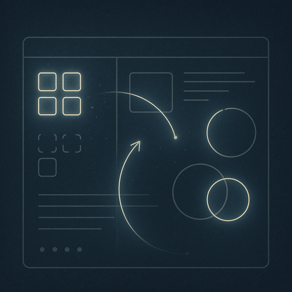
2. The 6 Principles That Quietly Guide Us
Let’s break down how Gestalt principles create interfaces that “click”:
1. Proximity
We interpret elements placed close together as related. In dashboards or navigation, proximity groups data points, guiding hierarchy without needing borders or labels.
2. Similarity
We assume items that look the same behave the same. In e-commerce, uniform product cards feel predictable and scannable—boosting decision-making speed.
3. Continuity
We naturally follow paths and curves. Think of scroll animations, progress bars, or timelines. Continuity supports flow—crucial in form-heavy tasks like checkout or onboarding.
4. Closure
Our minds fill in missing pieces. Clever UI leverages this for minimalism: progress rings, dashed outlines, or hinted interactions let the brain complete the picture.
5. Figure-Ground
We distinguish foreground from background to focus. Modal windows, hover states, and blur effects use this to emphasize what matters now.
6. Common Fate
Elements that move together feel linked. Microinteractions and transitions that synchronize build perceived cohesion and rhythm.
3. Designing for “Cognitive Fluency”
Cognitive fluency is the ease with which information is processed. When something is fluently designed, it feels faster, safer, and more trustworthy.
Gestalt design isn’t just visually satisfying—it reduces mental load. Think of it as UX ergonomics. Good design feels effortless because it is effortless, cognitively.
4. Strategy Tip: Audit for “Frictionless Flow”
Run a Gestalt-based audit on your product:
- Are related elements visually grouped?
- Are interactive components visually consistent?
- Is the user journey guided by flow—not forced by instructions?
If not, chances are your interface feels off—and conversion metrics probably show it.
Conclusion: Design Beyond the Surface
Interfaces that feel intuitive aren’t lucky accidents. They’re the result of psychological insight and design intelligence. Gestalt principles offer a system of “invisible glue” that holds interfaces together—without the user even noticing.
Because when UX feels right, business results follow.
Leave a Reply